
11:04:18
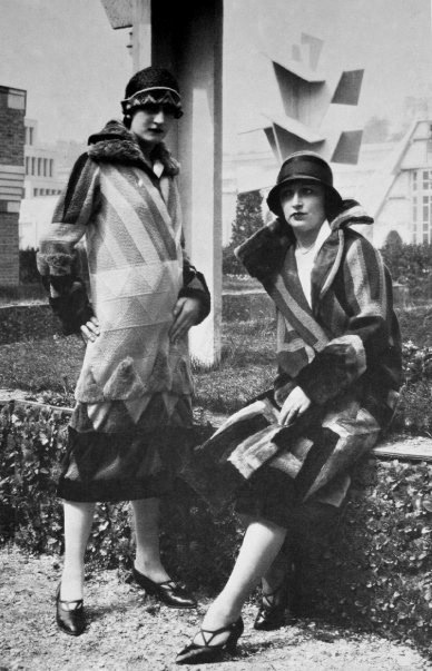
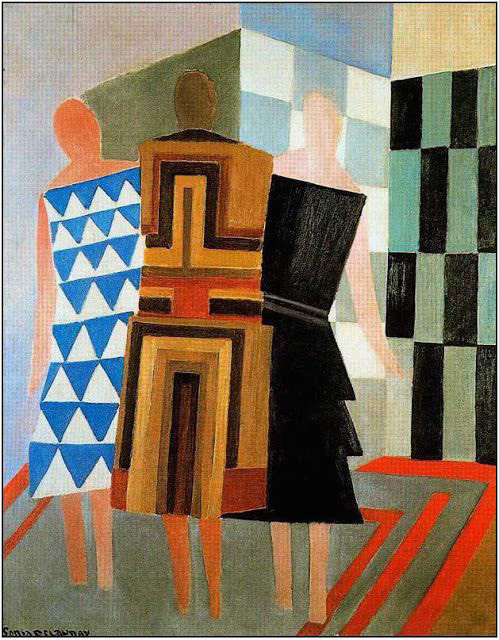
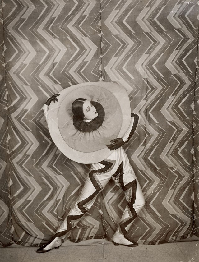
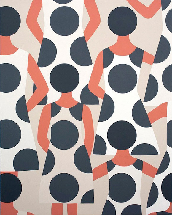
Sonia Delaunay
Simultaneísmo
Simultaneísmo
10:04:18

Jaime Hayon
20:10:16
20:10:16
Publicado a 16/09/2016
9th Berlin Biennale for Contemporary Art, Panel discussion “Post-contemporary Art” with Victoria Ivanova, Suhail Malik, and Tirdad Zolghadr, moderated by Armen Avanessian, in English
In conjunction with the Young Curators Workshop “Post-contemporary Art”
© KW Institute for Contemporary Art
9th Berlin Biennale for Contemporary Art, Panel discussion “Post-contemporary Art” with Victoria Ivanova, Suhail Malik, and Tirdad Zolghadr, moderated by Armen Avanessian, in English
In conjunction with the Young Curators Workshop “Post-contemporary Art”
© KW Institute for Contemporary Art
Panel discussion with Chris Dercon and Krist Gruijthuijsen, moderated by Armen Avanessian
In conjunction with the Young Curators Workshop "Post-contemporary Art"
In conjunction with the 6th Young Curators Workshop "Post-contemporary Art", conceived by Armen Avanessian, the Berlin Biennale is pleased to present a series of discussions surrounding a new time complex that marks the end of the enduring linearity between past, present, and future. In today’s post-contemporary conditions—being constructed by financial capitalism as well as social media, the military, artificial intelligence, and big data—the present is operationalized as risk or contingency; that is by a relation to the future.
Contemporary art has been the art of its time, bound to the capitalist present in which it took place. Under the paradigm of the post-contemporary, what are the characteristics of art and its production conditions? Three events within the framework of the Young Curators Workshop will be dedicated to each temporality. Past, present, and future will be analyzed in regard to their changed conditions, questioning the possible social role and function of (post-)contemporary art.
The event "Future Institutions" is aimed at the new direction of our speculative period. The future happens before the present, time arrives from the future. Together with Chris Dercon and Krist Gruijthuijsen, whose work as directors of the Volksbühne and KW Institute for Contemporary Art will decisively shape Berlin’s cultural life in the years ahead, Armen Avanessian will investigate possible strategies for long-term, sustainable institutional models. How can an institution represent the contemporary when planning procedures demand several months or even years? What is to be prioritized when designing and implementing a vision? How can we draft urgent discourses for the future?
This year’s Young Curators Workshop is conceived by Armen Avanessian and organized by Maurin Dietrich, Krisztina Hunya, and Valerie Amend.
The Young Curators Workshop "Post-contemporary Art" is a cooperation between Allianz Cultural Foundation, BMW Group, ifa (Institut für Auslandsbeziehungen), and the 9th Berlin Biennale for Contemporary Art. The participation of one French curator is made possible in conjunction with the program Jeunes Commissaires of the Bureau des arts plastiques of the Institut français Germany.
28:04:16
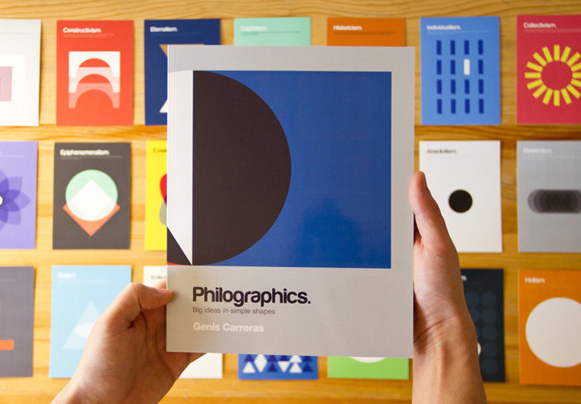
philographics
philographics
24:04:16
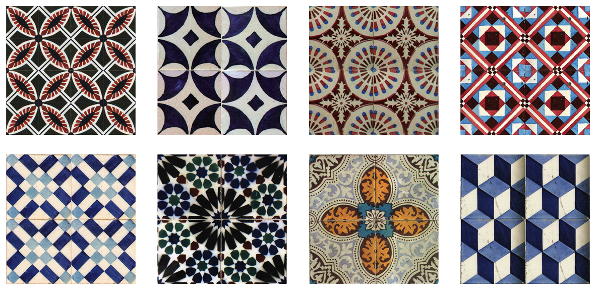
Mapping our tiles
Mapping our tiles
16:09:15
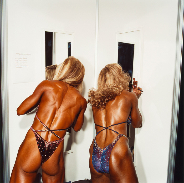
Brian Finke
Brian Finke
24:08:15
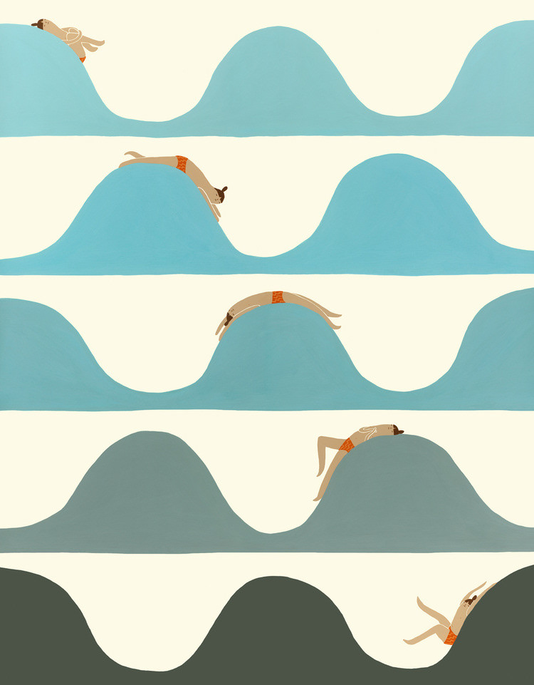
Laura Berger
Laura Berger
Kaye Blegvad
12:06:15
David Graham
Tirelessly traveling the United States, Graham captures the colorful, sometimes surreal, and often bizarre, in the thoroughly American landscape. Graham seeks out subjects which celebrate our singular freedom of expression in colorful roadside attractions and general oddities: toys and trompe l¡¯oeil signs found in suburban settings, idiosyncratic sculptures like the California dentist and his mammoth Amazon warriors, and eccentric scenes such as the Dallas hamburger stand that features a life size statue of Lenin. Chronicling the American scene with his unique sensibility and acknowledging popular forms of American photography: the snapshot, the family portrait and vacation pictures, Graham brings relevance to the creativity and dreams of the common man.
From site http://www.davidgrahamphotography.com/

07:04:2015
Geoff McFetridge is an LA-based designer running Champion Studio, whose client work ranges from illustrated book covers, public murals and music packaging, to the visual elements for Spike Jonze’s film Her.
Geoff McFetridge is an LA-based designer running Champion Studio, whose client work ranges from illustrated book covers, public murals and music packaging, to the visual elements for Spike Jonze’s film Her.
02:03:15
Jonathan Mwe di Malila is a twenty-one-year-old oil and acrylic painter who says his latest work serves to uplift his heritage and bring Congolese culture to the mainstream. The Kinshasa-born artist moved to Cologne, Germany, at a young age. Faced with the unfamiliarity of his new surroundings, he turned to art as a means of connecting with those around him. “I remembered very well that communication was really difficult to me because I couldn’t speak a single word in German,” he told us over e-mail. “So to let people know what I wanted to communicate I started drawing little pictures and paintings. By the time I learned German, my passion for art hadn’t slackened for a single moment.”
Jonathan Mwe di Malila is a twenty-one-year-old oil and acrylic painter who says his latest work serves to uplift his heritage and bring Congolese culture to the mainstream. The Kinshasa-born artist moved to Cologne, Germany, at a young age. Faced with the unfamiliarity of his new surroundings, he turned to art as a means of connecting with those around him. “I remembered very well that communication was really difficult to me because I couldn’t speak a single word in German,” he told us over e-mail. “So to let people know what I wanted to communicate I started drawing little pictures and paintings. By the time I learned German, my passion for art hadn’t slackened for a single moment.”
26:02:15
Alexia Webster
Alexia Webster

27:01:15
Stephen Shore
Stephen Shore

22:01:15
Damien Tran
Damien Tran
21:01:15
Gemma Anderson
Gemma Anderson
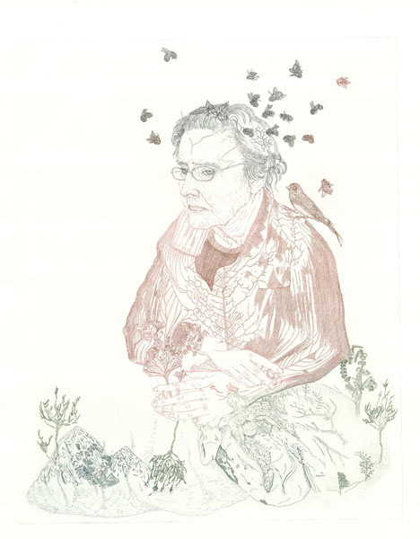
Para inspiração. Indicação de Berta Ehrlich. Curso desenho/pintura, Ar.Co.
http://www.gemma-anderson.co.uk/index.html
http://www.gemma-anderson.co.uk/index.html
19:01:15
Katsumi Komagata
Katsumi Komagata
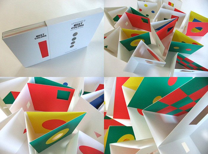
Para inspiração. Indicação de Yara Kono. Workshop Ilustração Infantil.
http://www.one-stroke.co.jp/english/shop1.html
http://www.one-stroke.co.jp/english/shop1.html
01:12:14
Playing With Design: Fredun Shapur
Playing With Design: Fredun Shapur
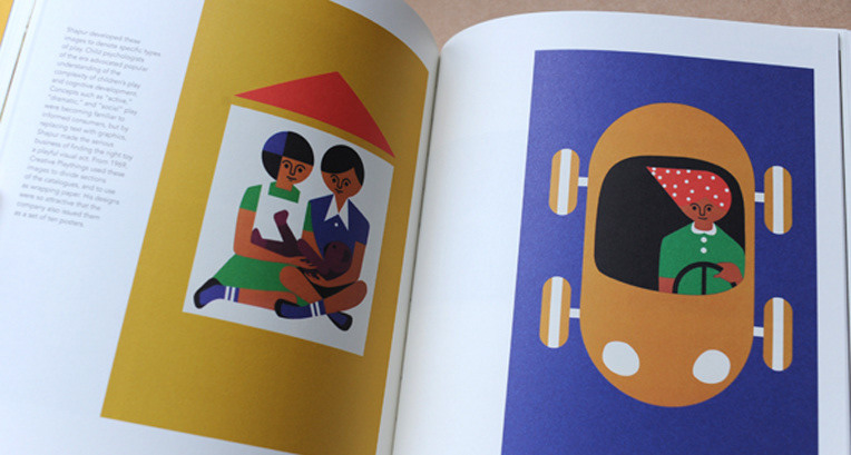
In recent years, designs for children by modern masters like Bruno Munari, Charles and Ray Eames and Alexander Girard have been brought forward, their diminutive audience seen not as undermining but attractive. We should add Fredun Shapur to that pantheon of designers of winning and sculptural objects for children. Shapur’s work was produced by an international array of manufacturers, including Naef, Trendon, Galt Toys, Fischerform and Selecta, but he is best known for transforming Creative Playthings’ logo, packaging and products.
As historian Amy F. Ogata writes in the new book Fredun Shapur: Playing With Design (edited by daughter Mira Shapur), “Shapur produced toys that highlighted and challenged the child’s agency while appealing to the parents’ tastes.” This is a point Ogata made, in greater detail, in her 2013 book Designing the Creative Child: Playthings and Places in Midcentury America, reviewed here.
The slideshow above shows ten spreads from the book, a thorough catalog of Shapur’s work for children. That is still the essential trick performed by the best toys, and the idea that many present-day, Whole-Foods toy companies are predicated on. As I’ve written before, too often it is the latter that comes before the former, with too much emphasis on sustainable materials (or cute typefaces) over the amount of tactile and visual information children are capable of dealing with.
Shapur, who is still alive, and still designing, was born in 1929 in South Africa. His career demonstrates the true internationalism of modernism at mid-century, as he practiced in London, collaborated in Princeton, and was manufactured in Switzerland. Shapur first enrolled at St. Martin’s in London, and then studied graphic design at the Royal College of Art. There, he was taught by Edward Bawden and Abram Games; Games’s work included the logo for the Festival of Britain (1951). Shapur worked in Prague in 1957, where he admired the growing array of Czech modernist toys.
Shapur opened his own office in 1959, working on logos, packaging and posters. He was inspired to create toys by his own children. In 1963, he designed Animal Puzzle, based on a set of interlocking squares, and Four-Way Blocks, using square rods and silk-screened graphics to allow children to make their own staccato creatures. His children’s book, Round and Round and Square (1965), employed a similar reduced geometric vocabulary. In other books he made shapes and colors into characters Blackie the cat and Spot the dog.
Shapur’s first toys were handmade, sanded by himself and his wife. He hired artisans to increase production, and ultimately sought out Swiss manufacturer Naef to increase scale. In the book, Ogata contrasts this way of making to the thousands of new plastic toys entering the postwar market. The few companies that maintained an emphasis on craftsmanship and natural materials are still collectible, like Danish designer Kay Bojesen’s jointed animals.
Shapur’s longest collaborative relationship was with Stephen A. Miller, director of product development for Creative Playthings in the mid-1960s. Miller was hired as part of the expansion of that company after it was bought by CBS in 1966. Shapur first proposed a new logo. “Neither explicitly boy nor girl, nor a child of any specific age, the logo signaled the wide range of products and the sophisticated, mostly un-gendered toys Creative Playthings championed in this period,” Ogata writes. Subsequently, Shapur redesigned the company catalogs and packaging along similar lines. Among my highlights of products designed by Shapur and sold through Creative Playthings are a series of cloth books made by Dean’s, issued in 1971. Animals shows parent and child of a variety of species, Pictures shows helicopters and skyscrapers, a chuch and an interior with Thonet chair.
Also clever with materials: his See Through Puzzles (1972) for ages 4+. These were made of printed, clear plastic sheets, which could be layered and rotated to create a complete image. The Four Faces Mylar masks (1971), made of pleated and fringed plastic. 1971 are very David Bowie. And unisex.
Perhaps my favorite Shapur toy, seen in the Museum of Modern Art’s “Century of the Child” exhibition, are the Playsacks made by Trendon (1968). Shapur took a paper sack used for kitchen waste, and transformed it into 12 animal disguises. Necessity is the mother of a father’s invention.
Shapur left Creative Playthings, where he was an official consultant, in 1974, after Miller departed. He designed logo for Miller’s new company, Novo Toys and continued to design toys for variety of European companies until 1980. After his retirement, he began working with discarded objects, leather and paper. The book includes examples mask-like faces made from sardine tins. It’s nice to see the creative mind continuing to play. Playing With Design has thoughtful text and bright, clear photography. The toys look so good, I couldn’t help wishing it also served as a revived Creative Playthings catalog. Anyone?
Alexandra Lange
http://designobserver.com/feature/playing-with-design-fredun-shapur/38291/
http://www.piqpoq.fr/
26:11:14
Adrian Shaughnessy
Rejection and the designer
Rejection and the designer
All designers live with rejection. It comes with the terrain—a terrain where decision-making is frequently based on personal taste and capriciousness (“Sorry, I just don’t like it”); a terrain where blunt commercial considerations trump everything (“Sorry, our market won’t understand this”); a terrain where a friend of mine who works for one of the big beasts in global corporate branding tells me that very little of her work is ever published (“Sorry, our new CEO has ordered a change of strategy”).
What are the results of working in a discipline where rejection, and its first cousins, compromise, dilution and modification, are ubiquitous? Does rejection harden ambition and act as a spur to better work? Or does it inject a debilitating toxin into the organs of creative ambition?
Social rejection has a harshness that we don’t find in other types of emotional setback. People are rejected by lovers, employers, institutions, friends, even parents. And the reason rejection hurts is because our brains have been formed by evolution to see expulsion as an early warning sign of danger: anything that places us outside the protective embrace of the group means that our survival is threatened.
Of course it’s not social rejection that designers fear, but it’s almost as deeply felt, and strikes at the core of what it means to be a creative producer. How designers cope with rejection of their work is fundamental to how they progress and develop as creative practitioners.
The novelist David Mitchell catches the exquisite pain of rejection so often experienced by neophyte writers: “I got a rejection letter from an editor at HarperCollins, who included a report from his professional reader. This report shredded my first-born novel, laughed at my phrasing, twirled my lacy pretensions around and gobbed into the seething mosh pit of my stolen clichés. As I read the report, the world became very quiet and stopped rotating. What poisoned me was the fact that the report’s criticisms were all absolutely true. The sound of my landlady digging in the garden got the world moving again. I slipped the letter into the trash … knowing I’d remember every word.”
What Mitchell is describing here is the fact that although in order to preserve our self-esteem we usually characterize rejection of creative products as an act of unfairness, the truth is that sometimes rejection is deserved. And since design is mostly about serving the needs of clients, it might not be unreasonable to say that any failure to meet those needs is the fault of the designer.
But few of us think like this. Instead we develop strategies for dealing with rejection. Some develop protective psychological armor that rejection bounces off; others take rejection as a personal slight and nurse wounds that never heal.
And there’s a paradox here for designers: if we wish to avoid rejection we nearly always have to choose blandness, but on the other hand, if we want to make work with depth and resonance, we have to risk rejection. So unless we decide to settle for blandness and cosy consensus, we have to live with the near permanent threat of rejection.
It’s a situation made more hazardous by the emergence of yet another terrain on which to experience rejection: the Internet and social media encourages open season on new work in ways that were unthinkable a decade or so ago. Hundreds of trolls telling us—and the world—that our logo, web design or typeface “sucks” may lack the informed critical acumen of David Mitchell’s “professional reader,” but like an insect bite, it can still hurt long after the wound is inflicted.
Shortly after writing that last sentence I randomly picked up a copy of Jung’s Memories, Dreams, Reflections—a book I hadn’t looked at for years. I opened it to a page that described his recovery from illness.
He wrote (my italics): “It was only after the illness that I understood how important it is to affirm one’s own destiny. In this way we forge an ego that does not break down when incomprehensible things happen: an ego that endures, that endures the truth, and that is capable of coping with the world and with fate. Then, <i>to experience defeat is also to experience victory</i>. Nothing is disturbed—neither inwardly nor outwardly, for one’s own continuity has withstood the current of life and of time.”